Virdio
Designing an AR Fitness Platform Across Every Screen

TL;DR
Home fitness users wanted engaging classes without expensive equipment, but no product delivered AR workouts across all devices.
Virdio's AR fitness tech could run on anything with a screen and camera, my role was to adapt the technology into a cross platform AR fitness subscription service.
I designed critical features across platforms: room setup, HUD, scheduling, onboarding, and a cross-platform design system.
Virdio successfully launched on all platforms, partnering with gyms and trainers to host hundreds of classes.
Expensivehardwarewasthebarriertoengaginghomefitness
“How might we make AR workout overlays usable, readable, and motivating across wildly different screen sizes, processing capabilities, and home environments?”
In 2021, the most engaging home fitness options were gated by expensive equipment. Peloton needed a $1,500 bike, Mirror needed a $1,500 screen, and everyone else was stuck with passive YouTube videos and zero performance tracking.
Virdio’s machine vision could read body poses through a standard camera and simulate exercise equipment in AR. That meant we could deliver Peloton-grade engagement to anyone with a laptop or phone, no hardware required.
Peloton
$1,500 bike
Mirror
$1,500 screen
YouTube
Free / No tracking
Virdio
Any camera
An early-stage startup, one designer, five platforms
Virdio had been licensing its machine vision tech to gyms for remote AR classes. I was brought on as the product designer to turn that capability into a direct-to-consumer subscription app, accessible from any device.
I had to ship across iOS, Android, web, desktop, Apple Watch, and smart TV on an aggressive timeline, with no existing design system and an engineering team 12 hours ahead of me on async collaboration.
Desktop is where the AR magic happens. Mobile is the browsing front door.
Themostaccessibledevicedeliveredthemostcompromisedexperience
I tested prototypes with our internal advisory board of fitness trainers and physicians. The turning point: the mobile phone, our easiest entry point, was inherently the worst platform for the core AR workout.
On a small screen, AR overlays competed with the video feed, and pose detection needed distance from a camera that users typically placed close or on unstable surfaces.
If mobile was the front door and mobile delivered the lowest-quality version of our differentiator, first impressions would undermine the whole value proposition.
Mobile
Most accessible
Unstable placement, AR overlays compete for visibility.
Desktop
Best AR quality
Larger screen, stable camera, overlays complement the experience.
More accessible devices tended to deliver lower-quality AR; desktop was the best place for the core workout experience.
Platform strategy: launching everywhere vs. focusing on the best experience
I pushed for a desktop-first approach, focusing our limited resources on making the larger-screen experience exceptional.
The CEO was adamant about launching on all platforms at once. Multi-platform availability was a competitive differentiator, and mobile was still the most accessible entry point for browsing and booking.
Option A
Desktop/Laptop First
Focus on larger screens where AR overlays were most usable, then expand to mobile later. Ship a polished hero experience faster with our small team.
Option B
All Platforms Simultaneously
Launch everywhere at once to maximize accessibility and differentiate from hardware-locked competitors.
What we chose
We shipped on all platforms but the UX guided users toward desktop and laptop as the recommended way to attend AR classes.
What I gave up
The chance to build one deeply focused experience.
ARworkoutclassesanyonecouldsetupintheirlivingroom
I designed an end-to-end experience that made AR fitness accessible regardless of device or home environment: from browsing and booking to live workouts with AI-powered pose detection and AR equipment overlays, all through an existing camera.
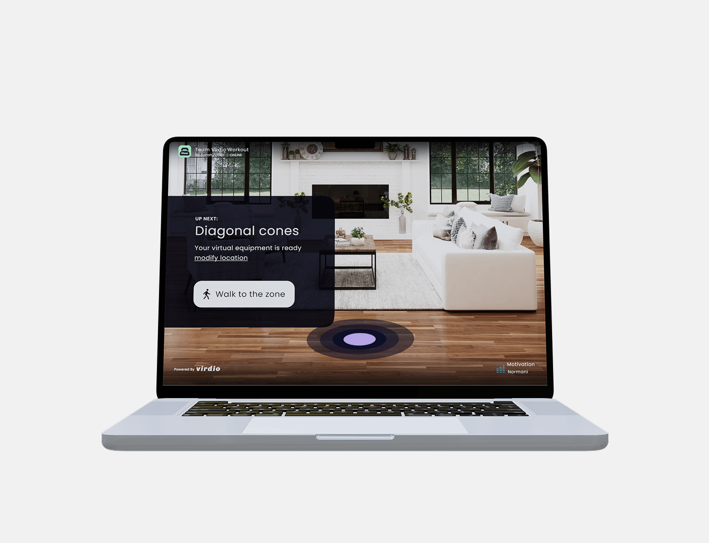
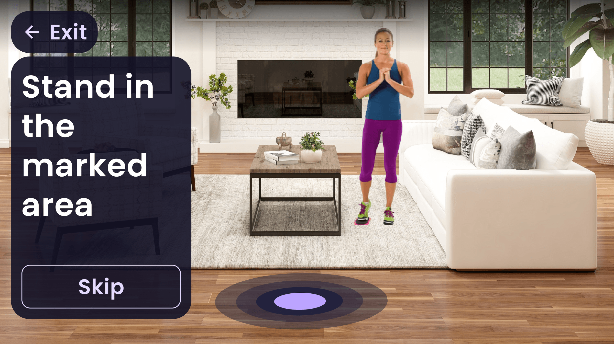
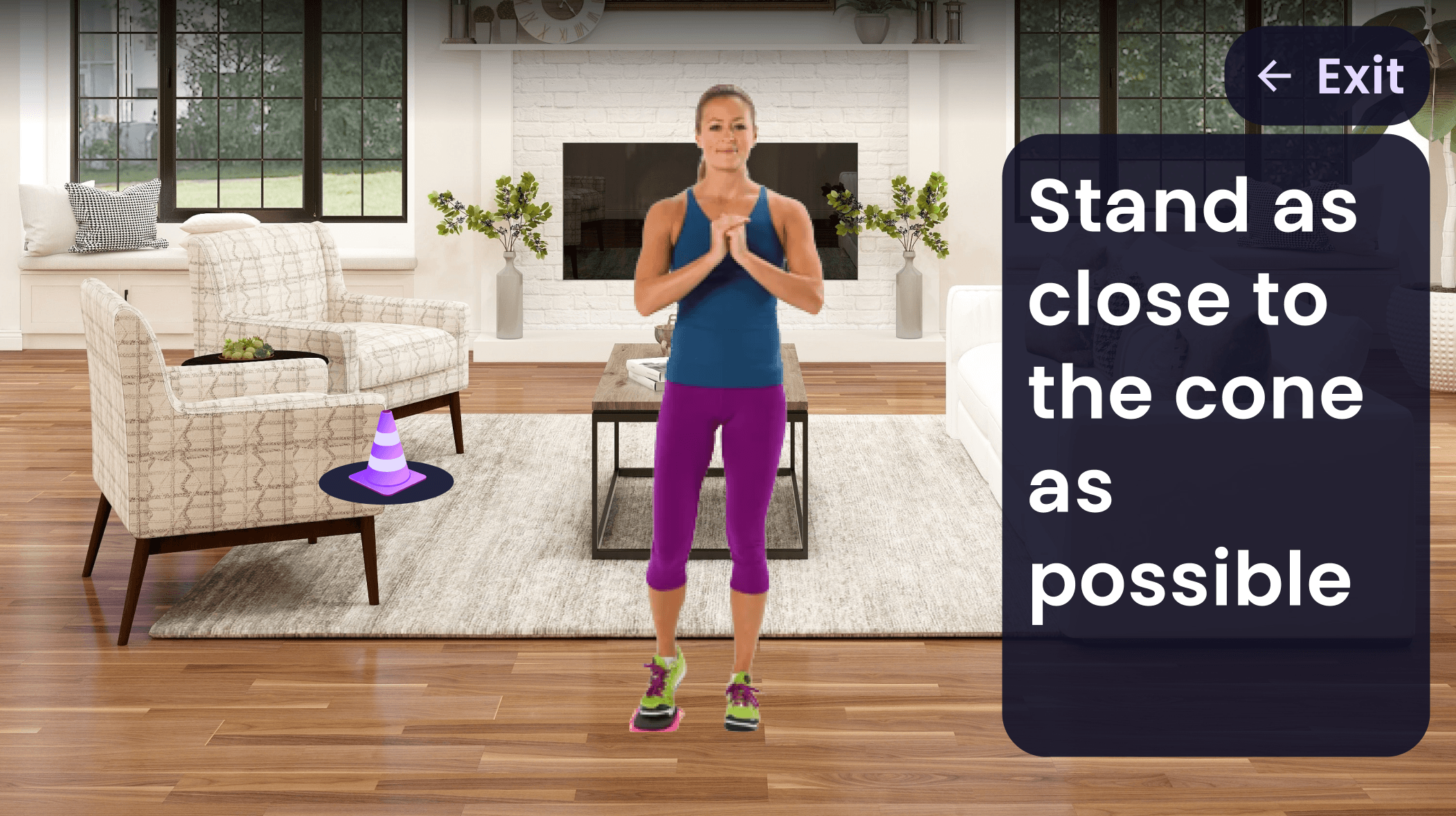
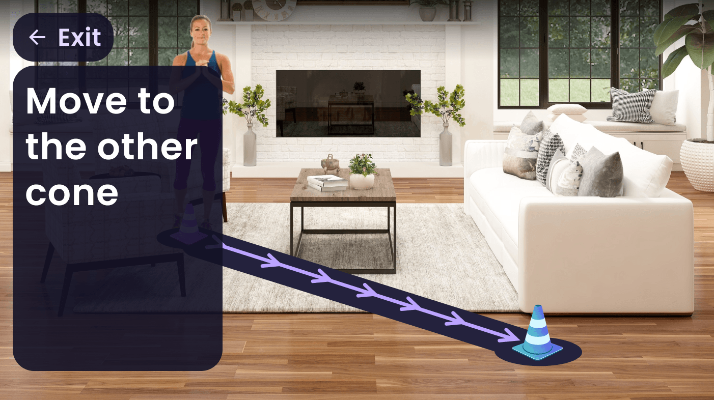
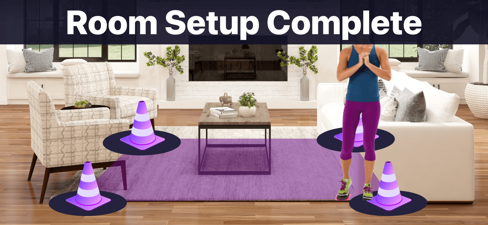
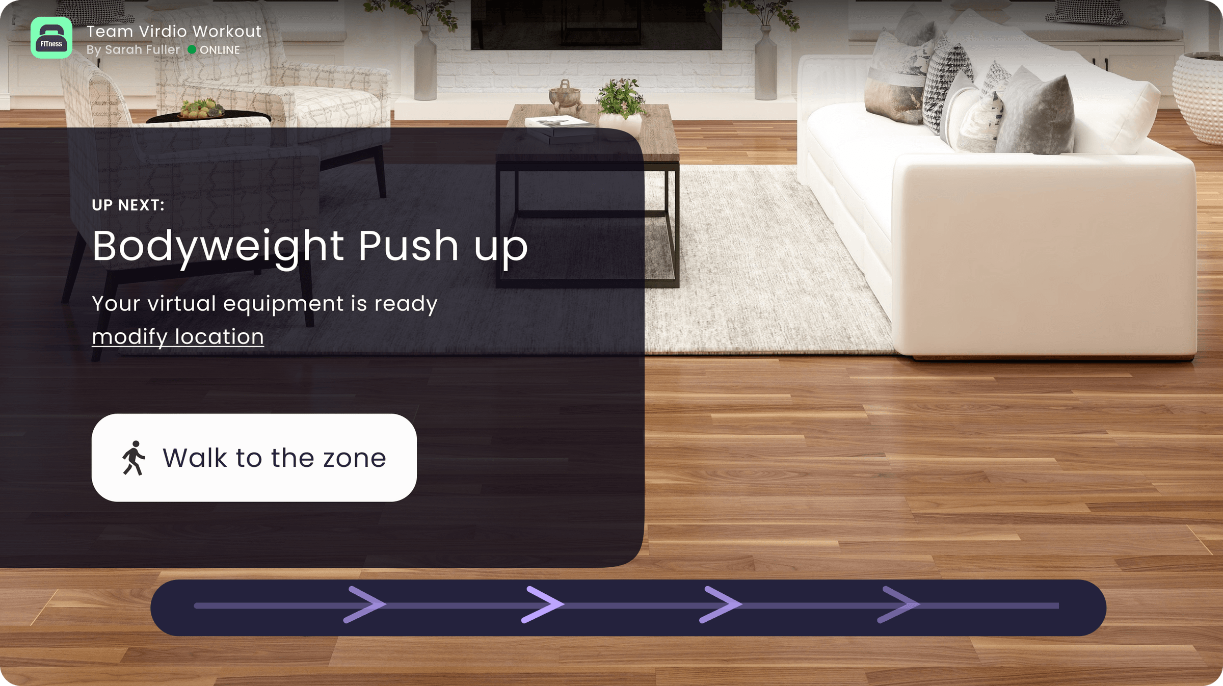
Room Setup & Calibration
Users had to calibrate their camera and define their play space. I made it approachable: a visual guide asks users to center themselves on screen with clear tilt indicators.
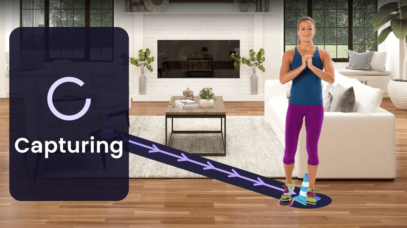
For room calibration, virtual cones appear on screen and users simply walk to the corners of their space, ending in a satisfying green checkmark confirmation.
Start Setup
Approach Cone
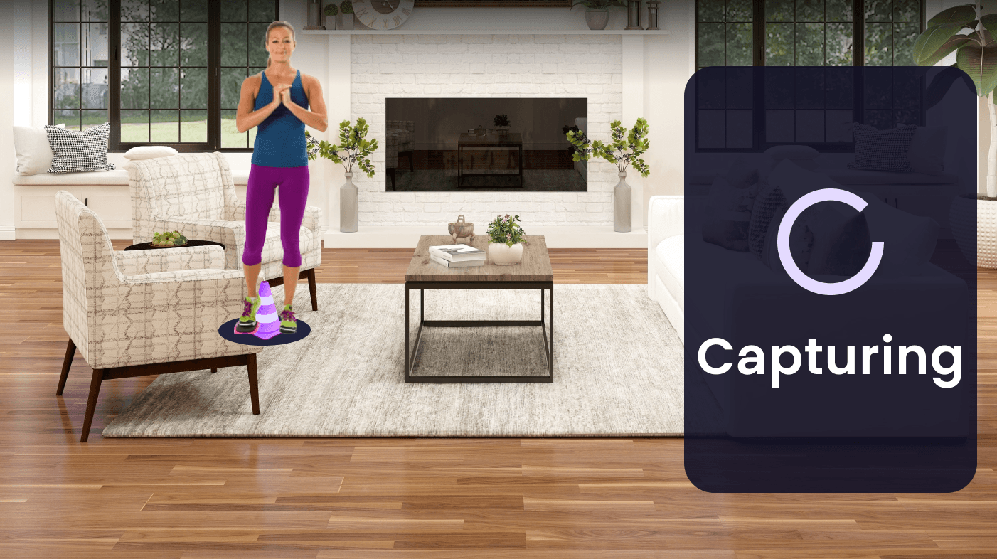
Capturing
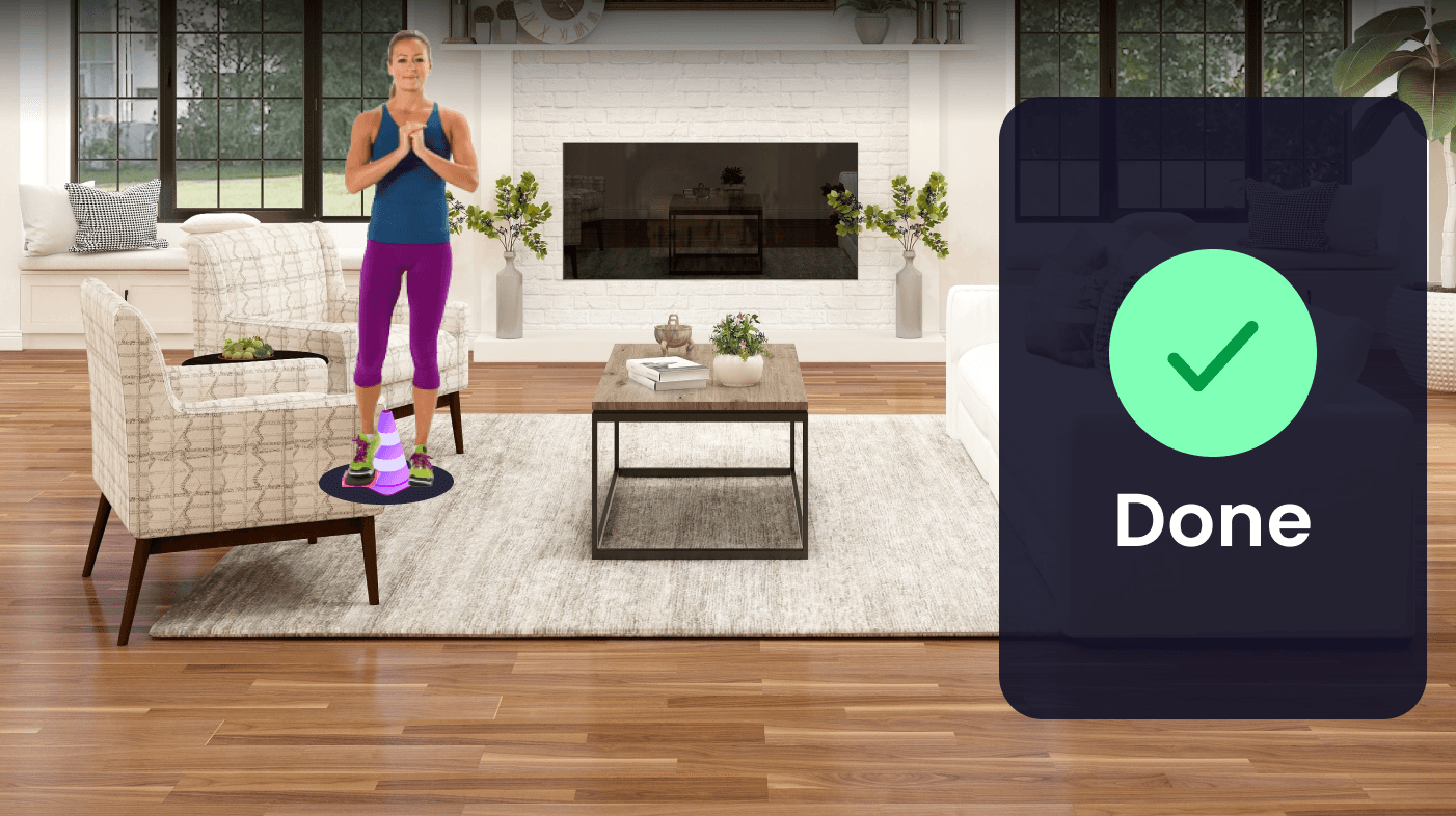
Cone Complete
Next Cone
Capturing
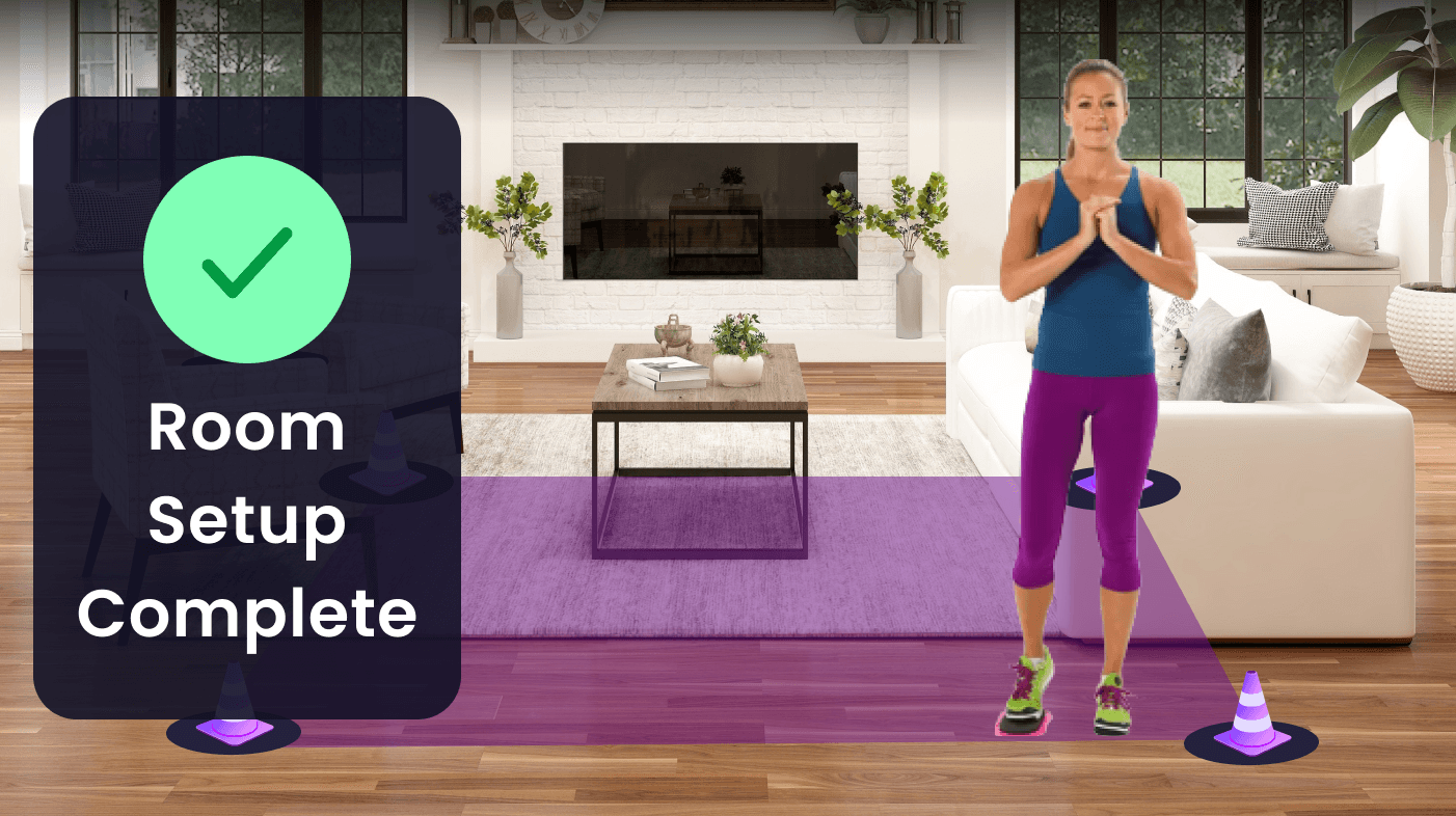
Setup Complete
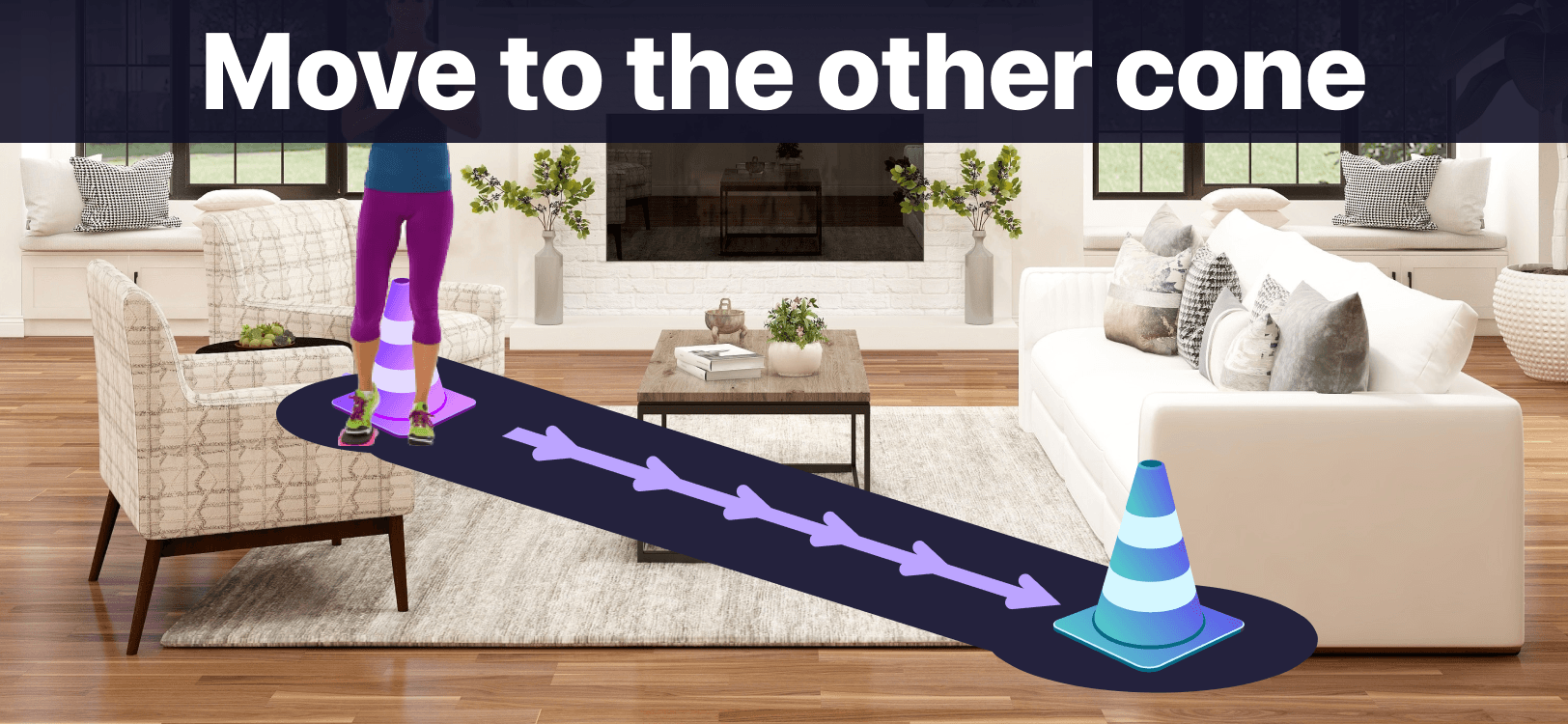
Mobile version of the room calibration had more prominent text and larger UI elements so the user could spot them better on a smaller screen.
What if setup fails?
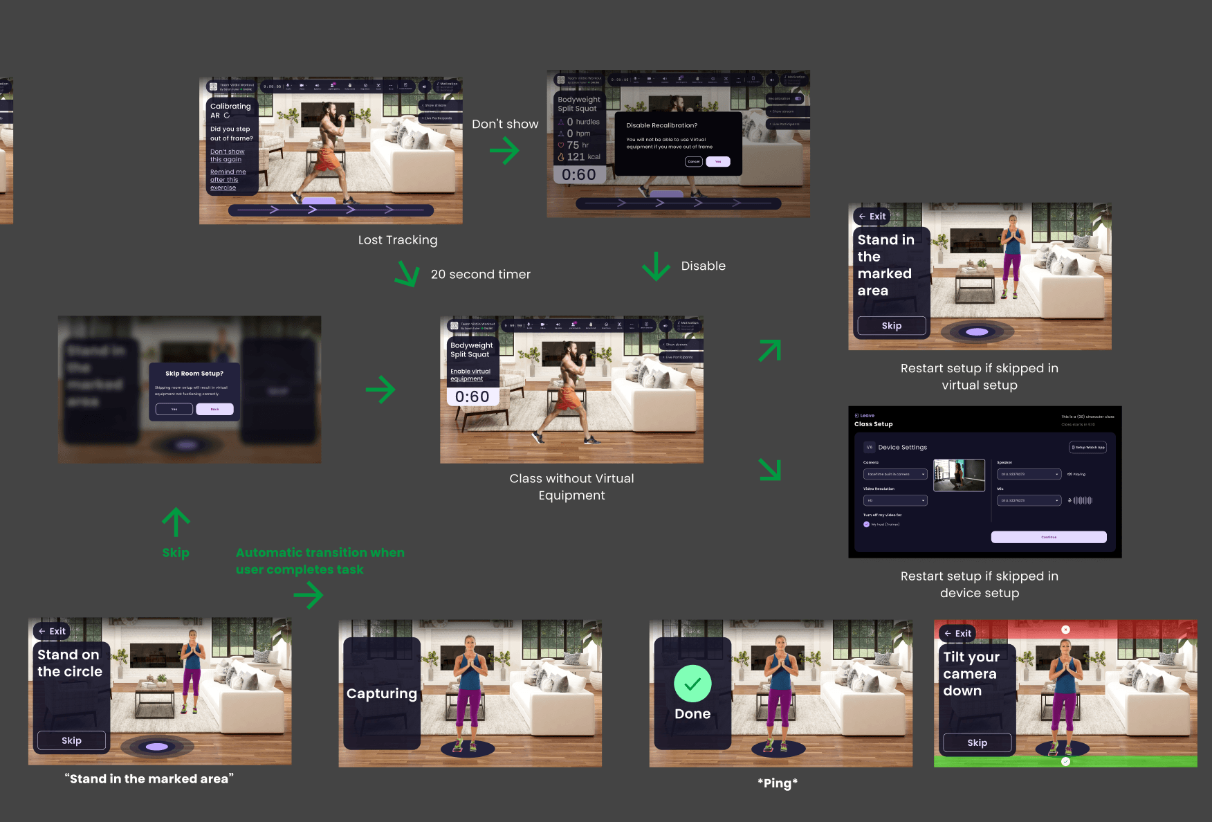
This flow covers what happens if calibration fails during a class or if a user skips setup: how the product recovers, what users see next, and when they can retry or continue with degraded AR.
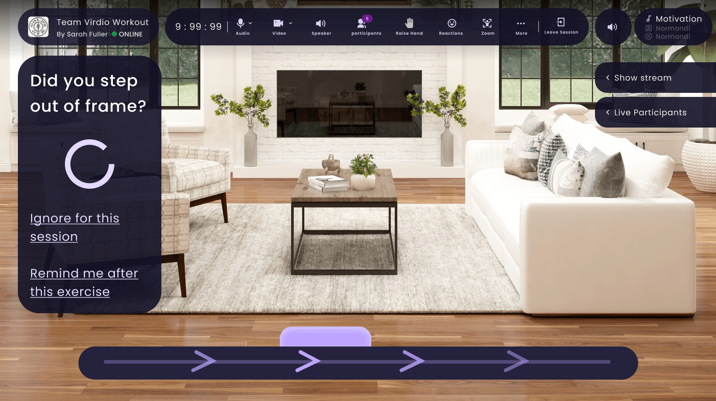
No-blame UI: “Did you step out of frame?” frames it as a system state, not a user error. Options let users ignore or get reminded later.
Interactive
Try It: Calibrate Your Space
Place 2 cones at opposite corners to define your workout zone. Drag to move, double-click to remove.
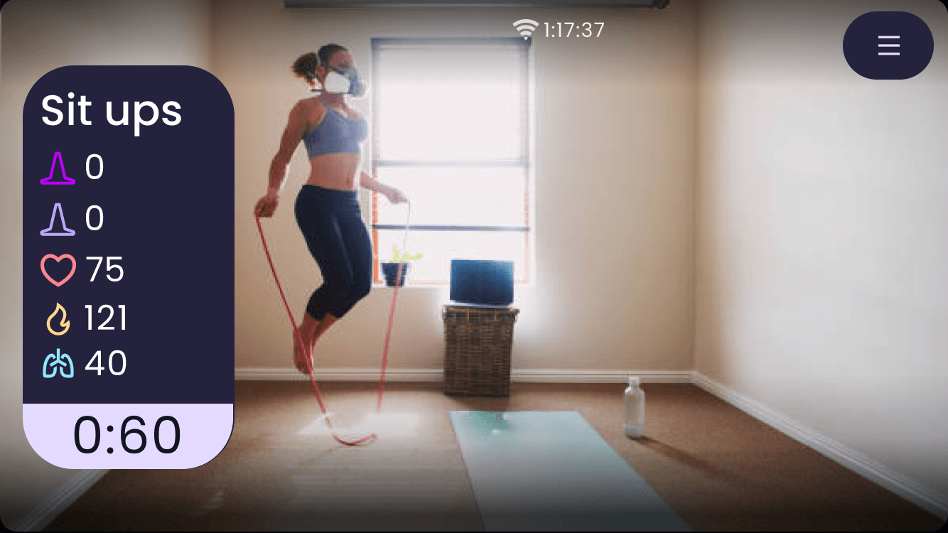
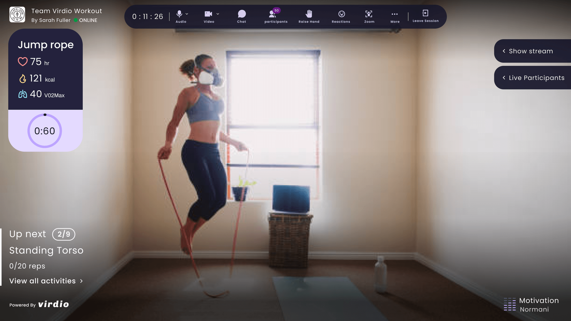
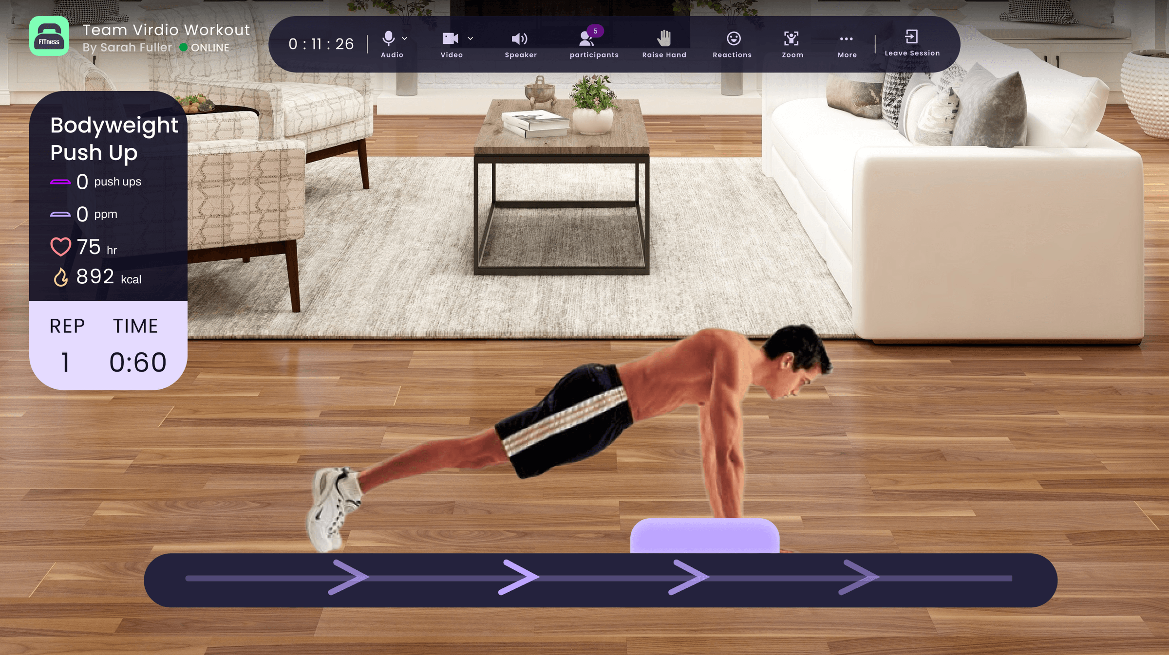
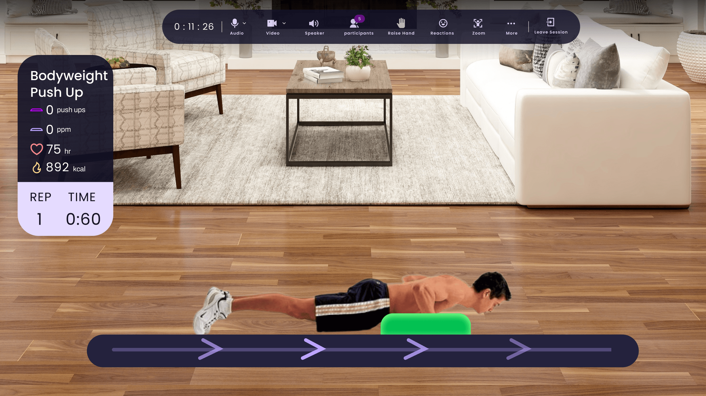
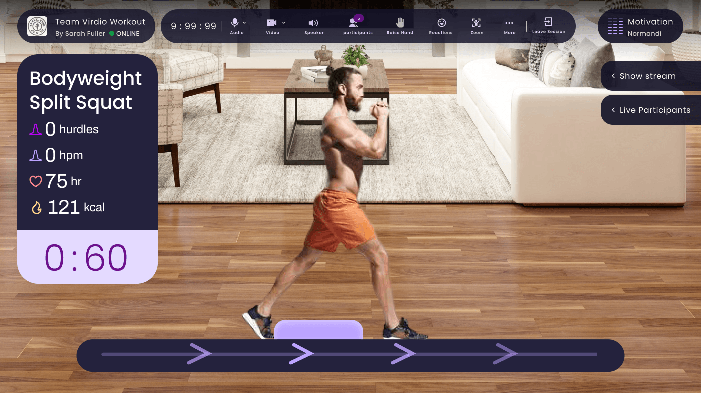
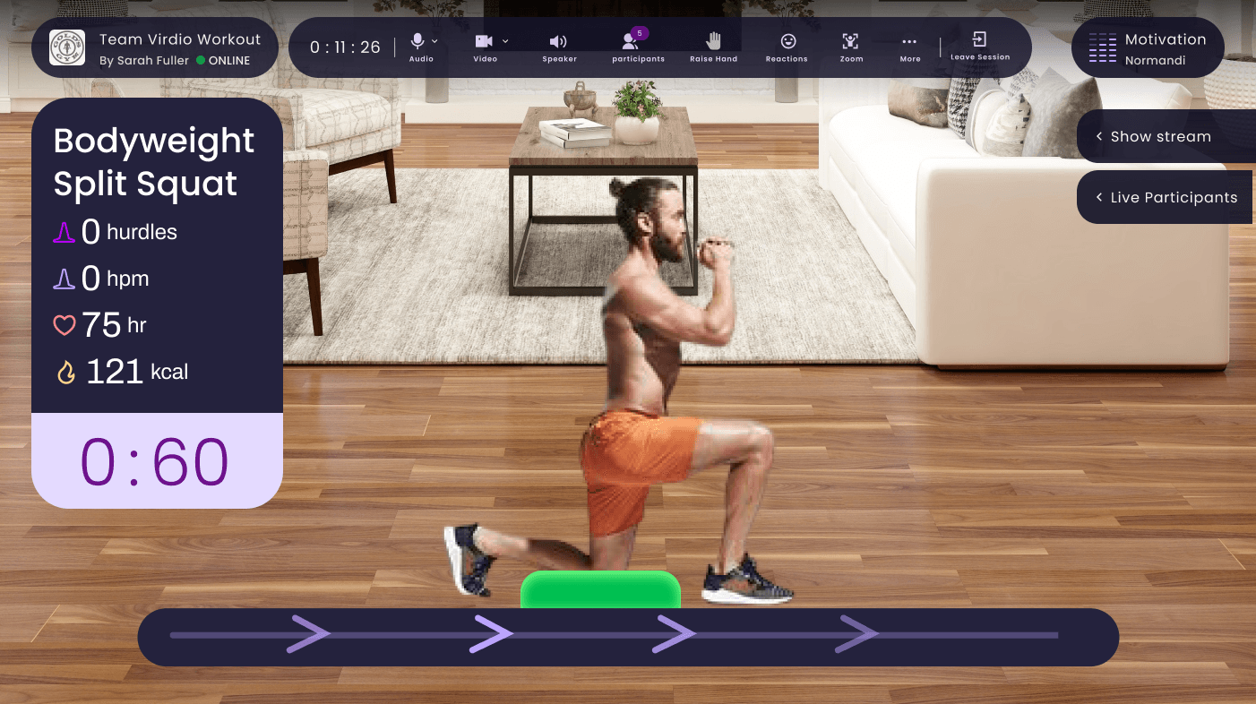
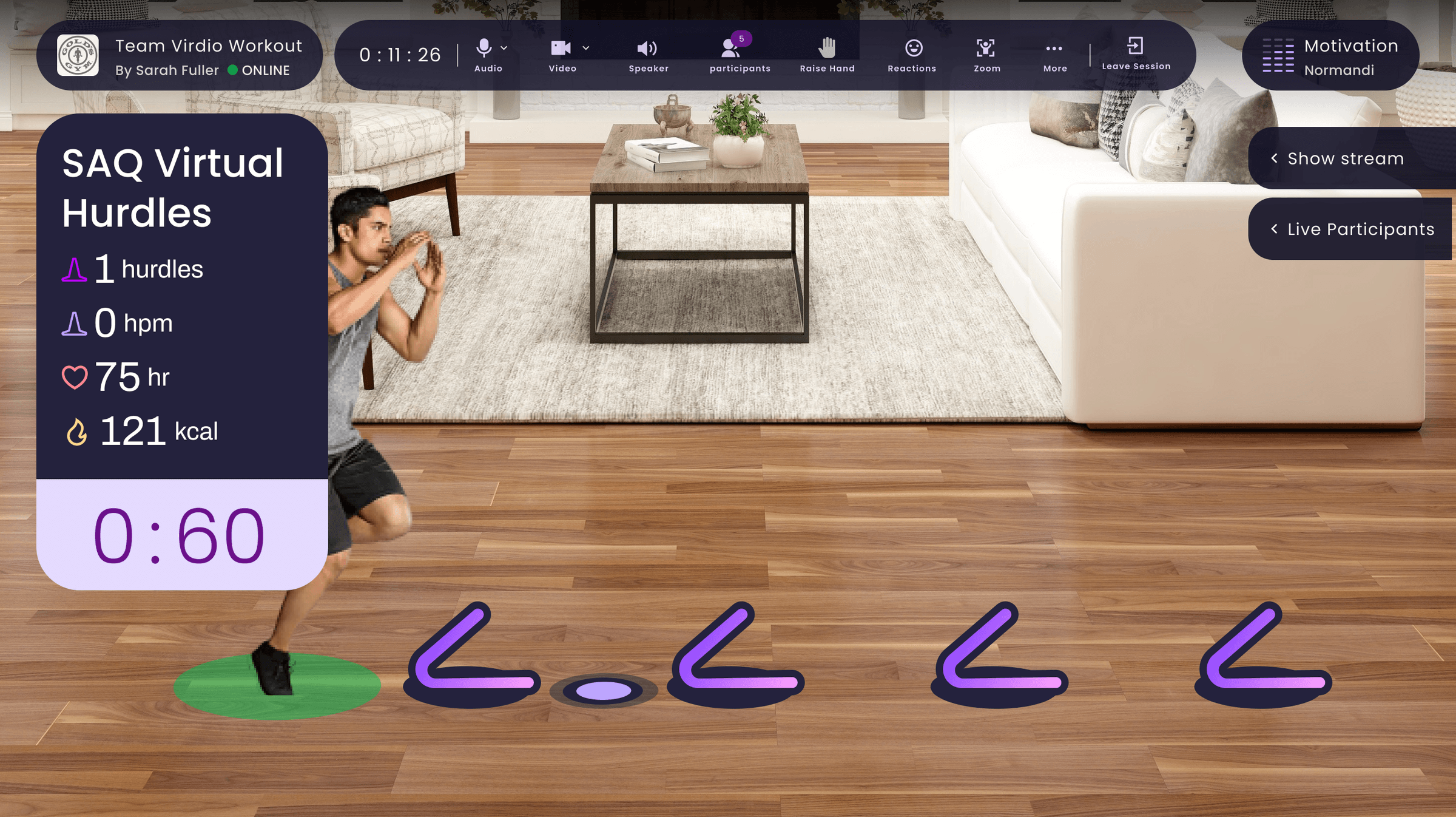
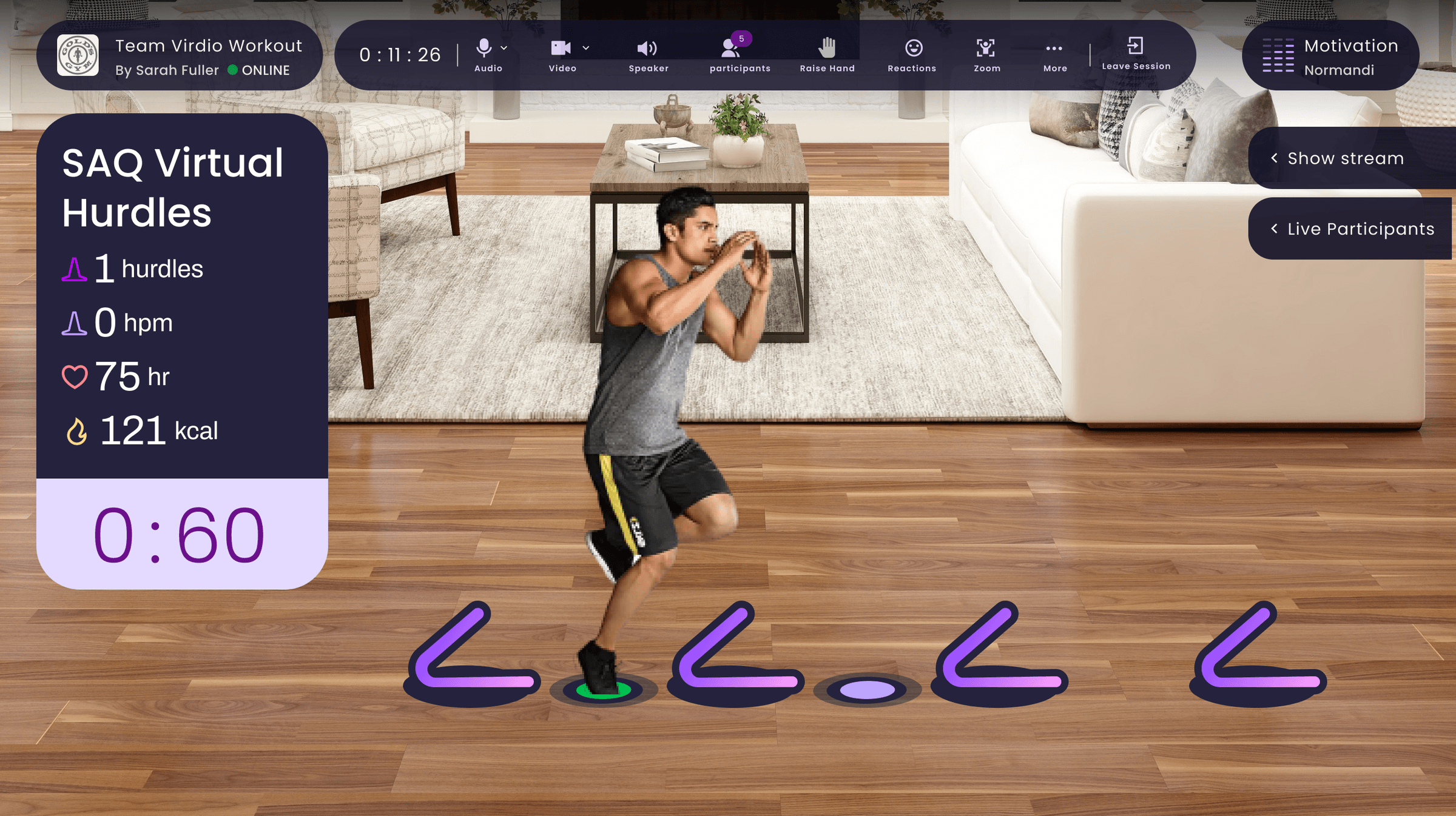
Live Workout HUD
Machine vision read body poses in real time, counting actions like punches, squats, and jumps. AR artifacts doubled as affordances that showed users the move, and as hit boxes that registered each completed rep.
I designed platform-specific HUDs. Desktop used the landscape canvas to surface metrics, class info, and participant data at once. Mobile collapsed and expanded contextually to preserve workout visibility on a small screen.
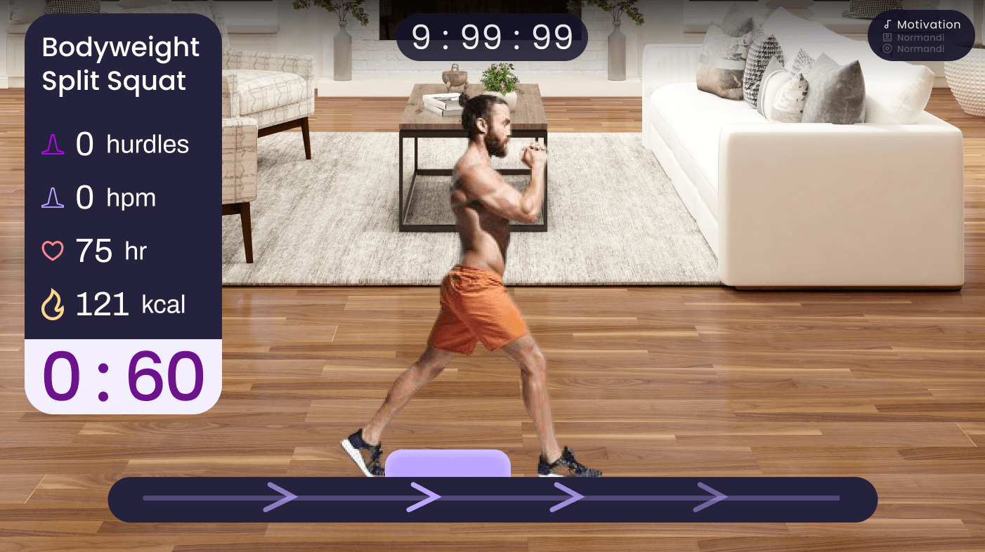
The desktop AR experience at its best: full metrics, timer, and AR equipment track visible at once.
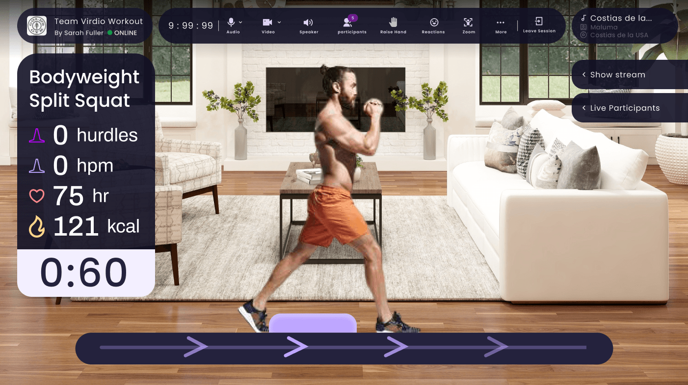
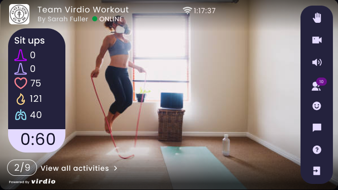
Desktop shows everything at once. Mobile collapses to preserve workout visibility.
The AR Exercise Library
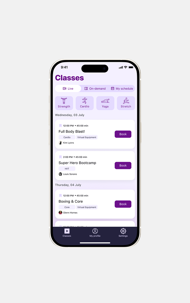
Scheduling & Design System
I built the design system from the ground up so it stayed consistent across all five platforms, governing color, typography, button styles, and component behavior.
I used light mode for browsing and discovery, and dark mode for anything class-related. The contrast created a clear psychological shift when users entered the workout.
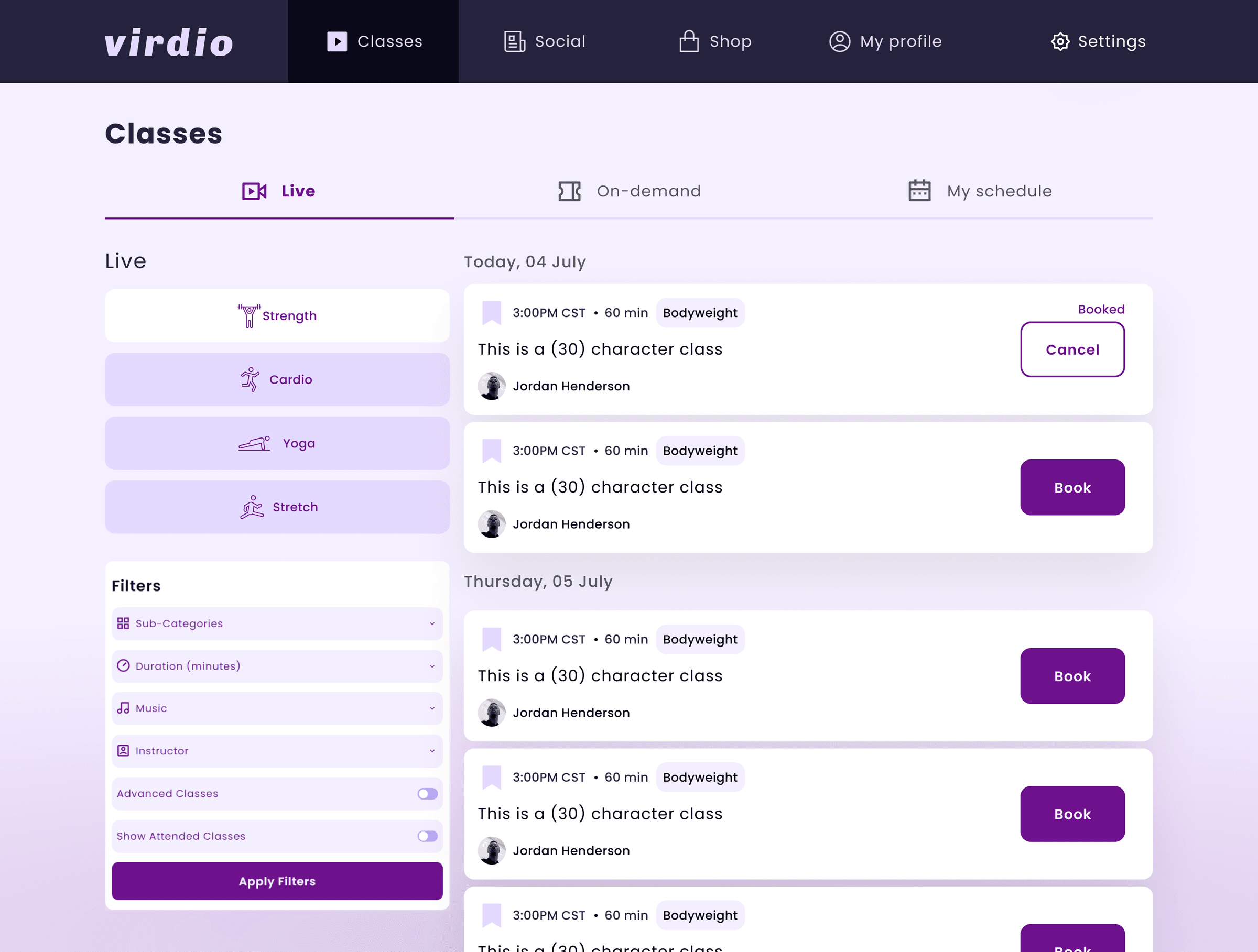
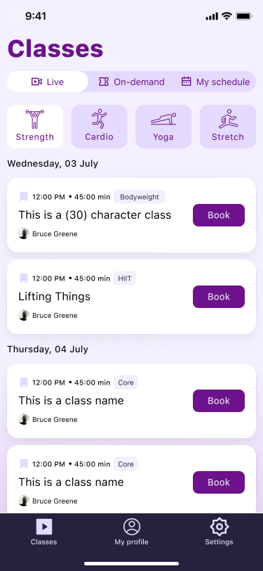
Desktop exposes filters inline for power browsing. Mobile surfaces categories as compact chips.
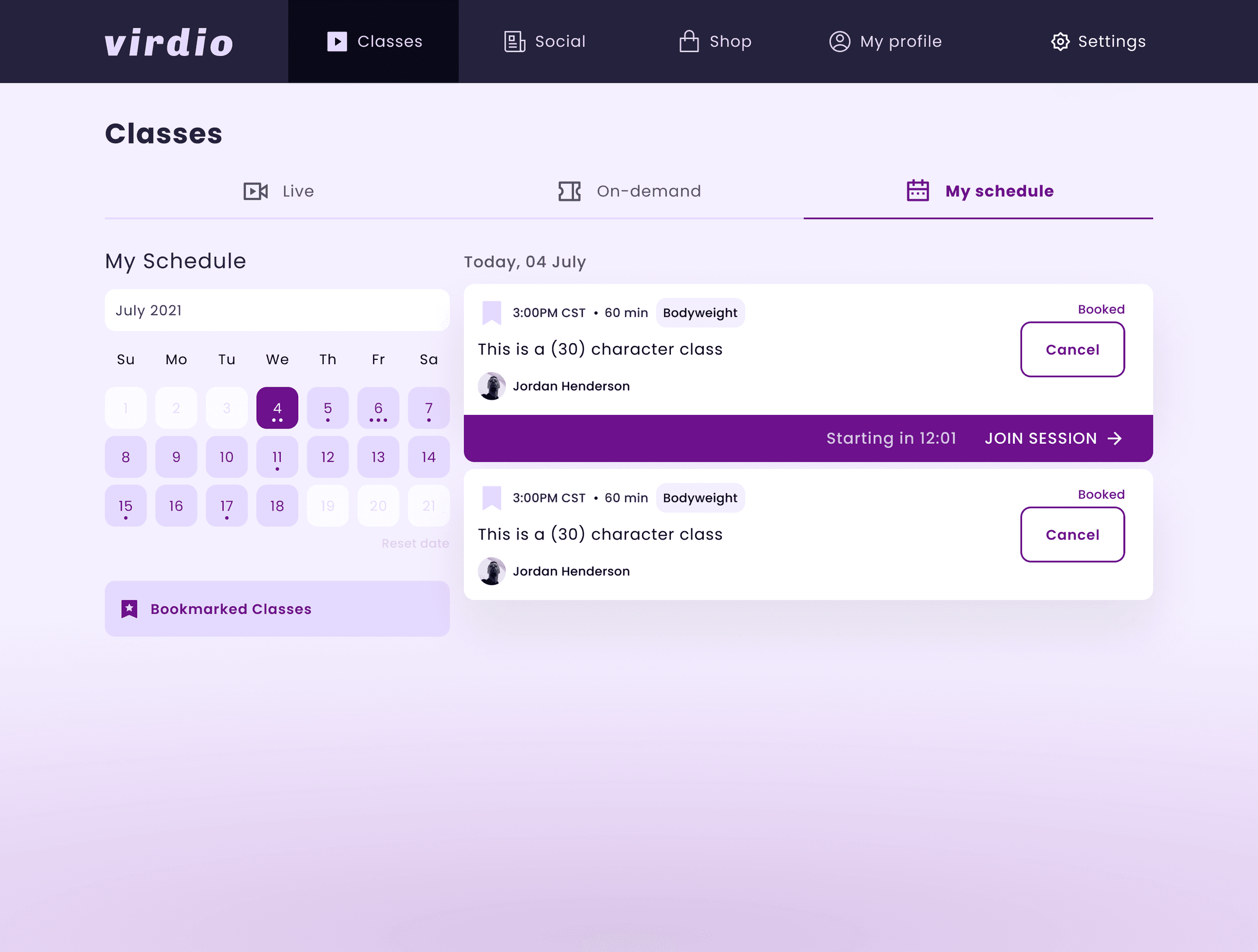
“My Schedule” connects browsing to action: calendar, booked classes, and a prominent Join Session CTA.
Role&Impact
What I Owned
- •Product designer from concept to launch across iOS, Android, web, desktop, Apple Watch, and smart TV.
- •Built the cross-platform design system from scratch: color, typography, components, and platform-specific adaptations.
- •Led the platform prioritization debate and shaped the desktop-first UX compromise.
- •Wrote detailed interaction and animation specs for async engineering handoff across a 12-hour timezone gap.
Impact
The app launched across all planned platforms in mid-2022 to some positive reviews, though consumer adoption stayed modest as the home fitness market cooled from its pandemic peak.
If I could do it over, I would focus on making one platform exceptional with a curated class library, and use that to wow users before expanding.